Color From the Garden
/I started weaving 40 years ago and I think I learned the most about it from trial and error. I am a member of the “full-size-sample club”. I have woven plenty of 4” or 6” or 10” samples to find out how the combination of weaving draft, sett (number of threads/inch), and yarn will work. But I have also woven plenty of blankets or scarves and decided to experiment as I went. That doesn’t mean that every project has been successful, but many have, and it’s certainly way to learn.
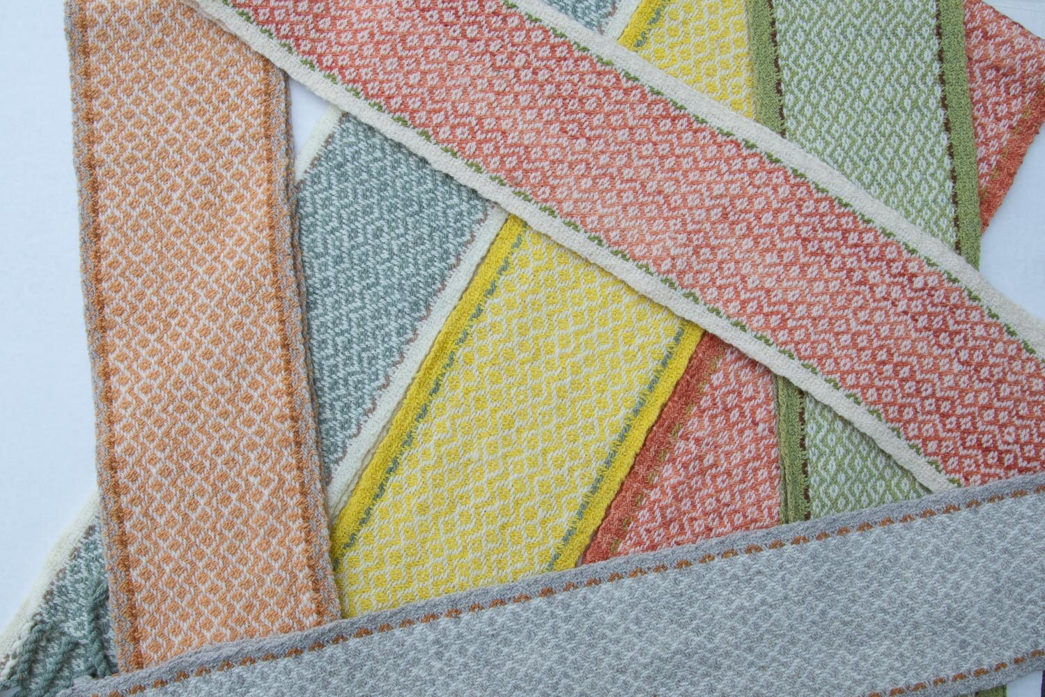
I wanted to design a weaving kit using my naturally dyed yarns and I wove several to make sure that the amount of yarn in each skein would work for the pattern. The great thing about these scarves is that they illustrate one of the principles of designing with color—that of value.
I have found that value (referring to the lightness or darkness) of a color may be more important for the success of a piece than the hue. Notice in which of these pieces the weave pattern stands out the most. It is in the scarves in which the dyed yarn has the greatest contrast with the natural (white) yarn.
Notice the two shades of green in this scarf. (Running out of the lighter color of green led to a good example of what I’m talking about.)
This yellow is certainly bright, but it is still a lighter value than some of the colors above and the weave pattern doesn’t show up as much.
This is one more illustration of the importance of value. That weave structure is the same throughout this scarf, but it only shows up where the contrast is great between the light (white) and the dark (purple and blue) colors.
By the way, all of these scarves are for sale either on my website or the Fibershed Marketplace.


